




Blog
Insights & updates from our experts


Resolve plant floor and IT issues before they disrupt production.

Stay audit-ready while resolving issues and reducing operational risk.
Resolve issues quickly with an AI-powered system that automates ticketing.
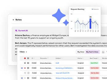
Unifiy IT, HR, Facilities, Finance, and more on a single, AI-powered service platform.
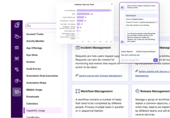
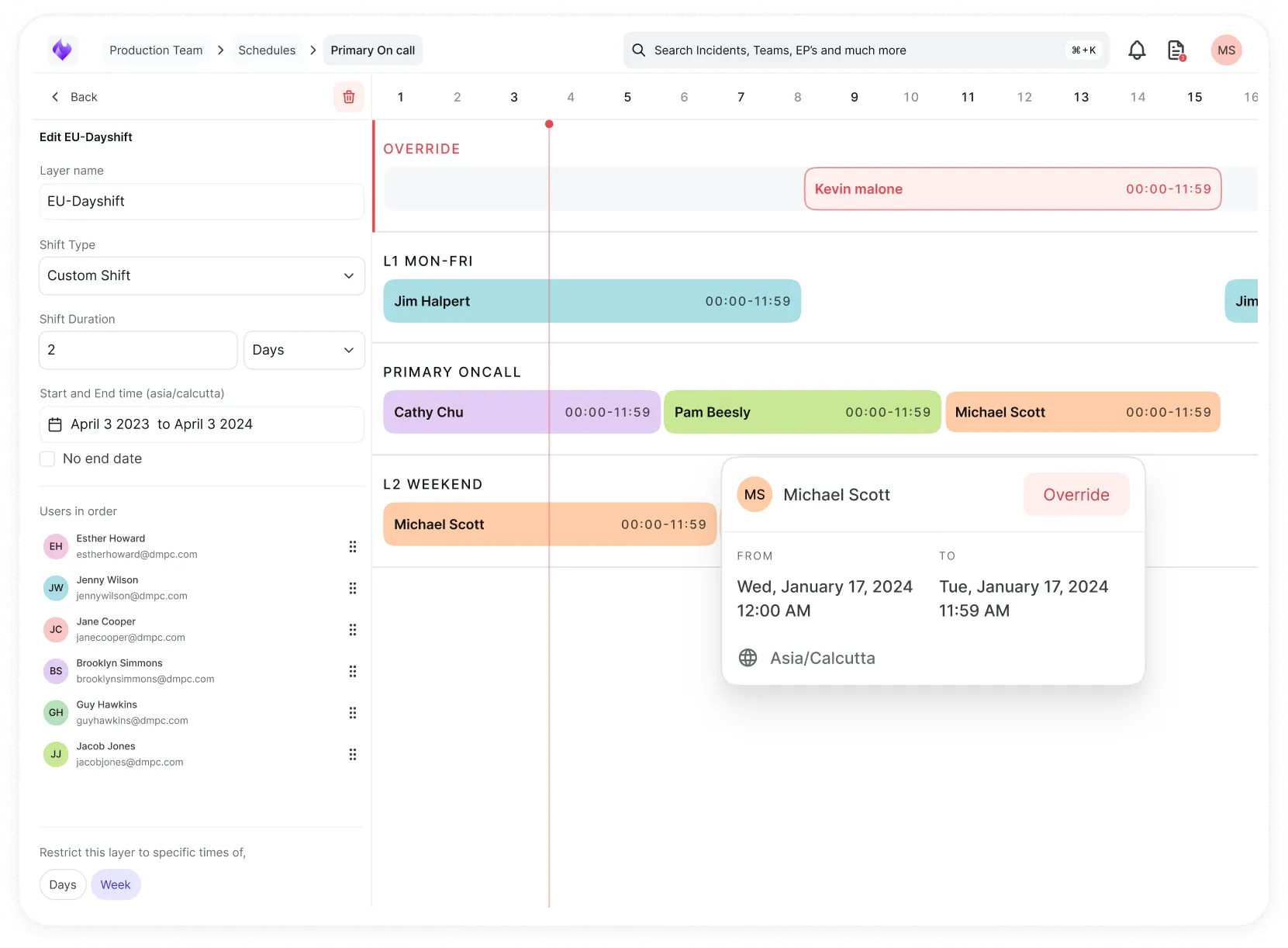
Simplify on-call scheduling, automate escalations, and reduce burnout.
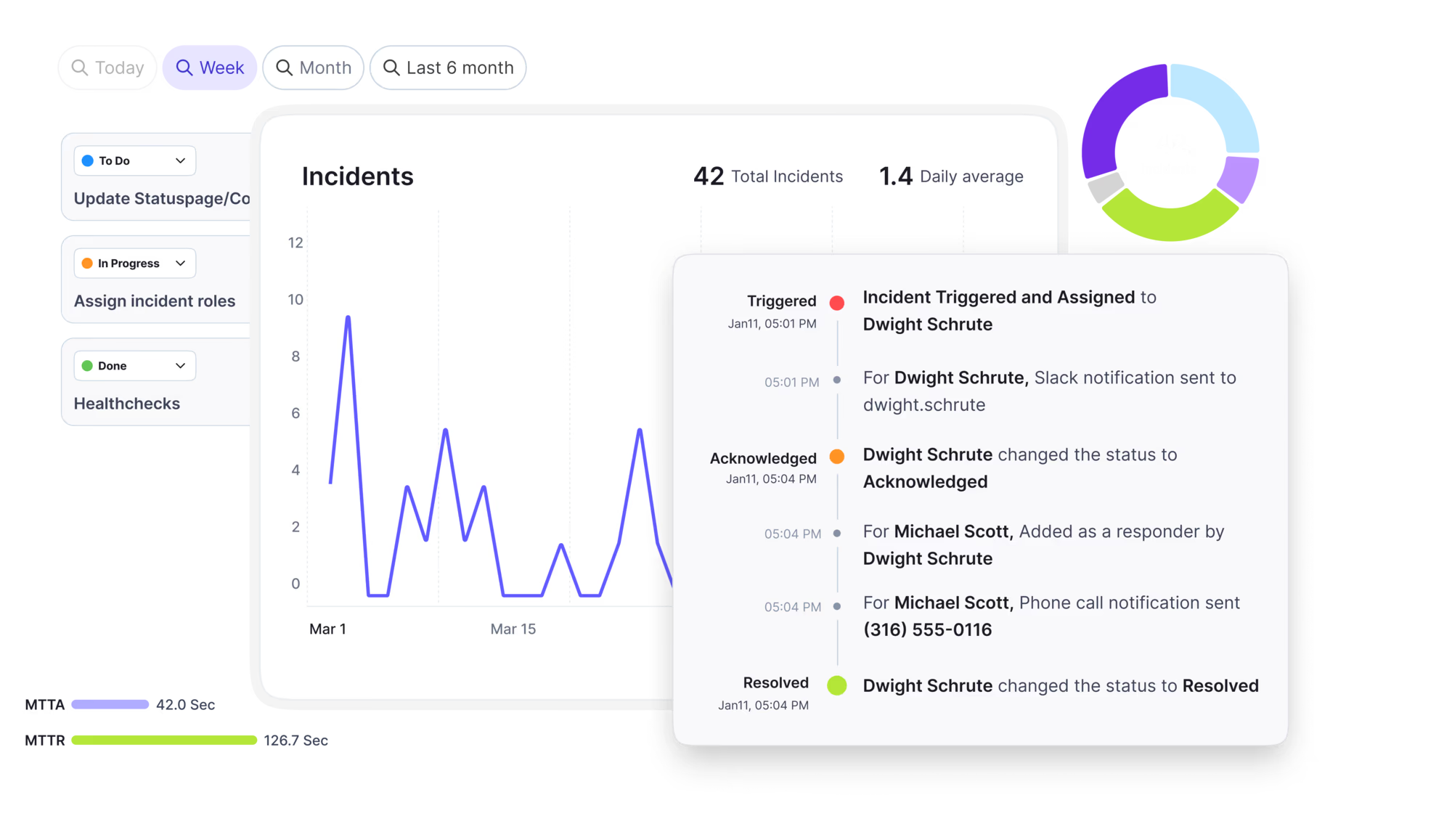
Automate postmortems, AI summaries, and post-incident workflows
Create, organize, and continuously improve your knowledge base to find the right answers with Sera AI.
We're here to help

The integration with Atlassian Jira using the Xurrent Integration Service is

The integration with Atlassian Jira using the Xurrent Integration Service is

The integration with Atlassian Jira using the Xurrent Integration Service is

The integration with Atlassian Jira using the Xurrent Integration Service is

The integration with Atlassian Jira using the Xurrent Integration Service is

The integration with Atlassian Jira using the Xurrent Integration Service is

The integration with Atlassian Jira using the Xurrent Integration Service is

The integration with Atlassian Jira using the Xurrent Integration Service is
Resolve issues quickly with an AI-powered system that automates ticketing.
Unifiy IT, HR, Facilities, Finance, and more on a single, AI-powered service platform.
Simplify on-call scheduling, automate escalations, and reduce burnout.
Automate postmortems, AI summaries, and post-incident workflows
Create, organize, and continuously improve your knowledge base to find the right answers with Sera AI.
Resolve plant floor and IT issues before they disrupt production.
Stay audit-ready while resolving issues and reducing operational risk.

Detect, respond, and resolve incidents fast to cut downtime and MTTR.

Keep your store online, even during your biggest sales moments.

Protect patient data and resolve issues fast, so care teams stay focused on care.

Standardize service delivery across every store and channel.

We are here to help 24/7

Connect with other Xurrent Users

Get insights and tips on how to get the most out of Xurrent

Apps, APIs, and updates

Xurrent service functionality

Eliminate manual tasks, optimize workflows, and deliver faster resolutions.
Learn how organizations have reduced downtime, improved 50% MTTA & MTTR, and cut costs with Xurrent IMR.
Discover Xurrent IMR's quick support, bidirectional integrations with Jira and Slack, and more cohesive incident response capabilities compared to Opsgenie.
Understand why users value Xurrent IMR for its intuitive interface, efficient incident alerting, customizable On-call schedules, and escalations.
How do IT ops leaders structure executive reporting and SLA dashboards that the business actually trusts?
Most don't. And the reason is almost always the same: the data is fine, but the reporting structure built around it isn't. That gap, between having good data and presenting it in a way that drives decisions, is where most IT ops leaders lose the room.
Most executive reporting starts in the wrong place. Charts get pulled together that look impressive: ticket volumes, resolution percentages, uptime numbers. They get handed to leadership and called reporting.
But metrics are only valuable if they drive action. If a number can trend in either direction and nobody knows what to do next, that metric has no business being on an executive dashboard. It’s decoration.
The test is simple: when a number moves, does it tell you what happened, suggest why it happened, and point toward what to do about it? If the answer is no, it’s a vanity metric dressed up as an insight.
Here’s something worth keeping in mind: executives don’t want to dig through data. They want someone to dig through it for them.
They want the headline, the context, and the hypothesis. Not the raw numbers and a shrug.
So instead of “here’s the dashboard,” the conversation becomes: “We breached SLAs more frequently this week. Ticket volumes spiked 40% because of a system outage, which overwhelmed our queue. Here’s the data that tells us that. Here’s what we did about it, and here’s what we’re watching going forward.”
That’s executive-ready reporting. You’re doing the detective work so they don’t have to. And that detective work—showing the reasoning and not just the conclusion—is where trust actually gets built.
The teams that figure this out see real organizational change. XAL Lightning, a lighting manufacturer with 1,100 employees across 40 international locations, used to spend roughly a week producing reports and billing manually in spreadsheets. With real-time reporting and dashboards, that same work now takes minutes. The data didn’t change. The access to it did.
Not every spike is a crisis. Not every anomaly is a pattern. Getting that distinction right is the difference between useful reporting and noise that trains executives to stop paying attention.
Consider a week where SLA performance drops and three people were out sick simultaneously. Odds are that’s a one-time anomaly. Worth noting, worth watching. But not worth re-architecting a staffing model over.
Now consider the same staffing shortfall happening every quarter for three quarters running. That’s a structural problem that requires real investment or process change.
Both scenarios look identical on a single-week dashboard. That’s why the current state and the longer trend need to live in the same report. The immediate picture tells you what happened. The multi-timeframe view tells you whether it matters.
Week level, individual level within the week, and the longer arc across months or years. Together, they separate signal from noise. Without all three lenses, nobody in the room can make that call.
For IT service ops specifically, a handful of metrics earn their place on an executive dashboard because they’re inherently actionable and tied to real service outcomes:
The numbers alone don’t complete the picture. What makes these metrics useful is pairing them with the why behind each movement. A rising MTTR means something different during a major infrastructure migration than it does during a stable period. Context is everything.
And the baseline matters too. Sport Vision Group, a retailer supporting 8,000 employees across 751 stores in 13 countries, had SLA achievement sitting at 0% when they started. Not because service was catastrophically bad, but because performance simply wasn’t being tracked. Once visibility was established, SLA achievement for critical services climbed to 97% or above. The performance was always improvable. The reporting infrastructure to see it, act on it, and build executive confidence around it just wasn’t there yet.
Executive trust in reporting doesn’t come from a slicker UI or more data points. It comes from three things, consistently delivered:
Actionable metrics that drive decisions. If the number can’t tell you what to do, cut it.
Narrative context that explains what moved the numbers. Bring the hypothesis, not just the headline.
Multi-timeframe visibility that distinguishes anomalies from trends. One bad week and a systemic problem require different responses, and executives need enough context to tell them apart.
Get all three right, and a dashboard stops being a report card that leadership glances at and moves on from. It becomes something the business actually uses to make decisions.
The data was never the obstacle. The story built around it is what makes it actionable.
Xurrent gives IT ops teams the reporting infrastructure to do all of this without building it from scratch. Real-time dashboards, multi-timeframe visibility, and structured SLA tracking are built in, so the work shifts from assembling data to actually using it.
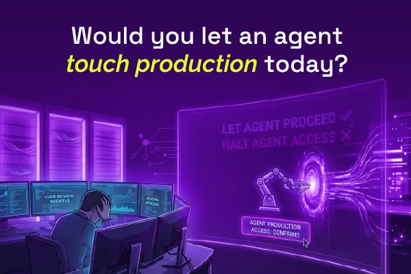
Most AI SREs are pattern matchers trained on public data. They know what a memory leak looks like in the abstract. They don't know that your payments-api has a flaky liveness probe everyone ignores, that the checkout team owns the retry policy, or that the last three "database incidents" were actually cache misconfigurations. That knowledge lives in your postmortems, your Slack channels, and the heads of two senior engineers.

.avif)