.webp)


Blog
Insights & updates from our experts
Resolve issues quickly with an AI-powered system that automates ticketing.

Resolve issues quickly with an AI-powered system that automates ticketing.

Resolve issues quickly with an AI-powered system that automates ticketing.

Resolve issues quickly with an AI-powered system that automates ticketing.
Resolve issues quickly with an AI-powered system that automates ticketing.
Resolve issues quickly with an AI-powered system that automates ticketing.
Simplify on-call scheduling, automate escalations, and reduce burnout.
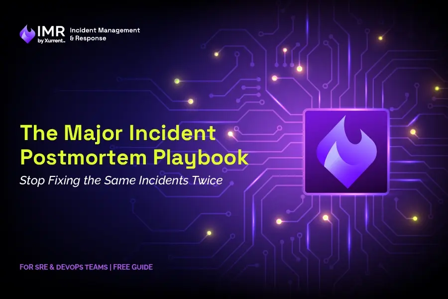
Automate postmortems, AI summaries, and post-incident workflows
We're here to help

The integration with Atlassian Jira using the Xurrent Integration Service is

The integration with Atlassian Jira using the Xurrent Integration Service is

The integration with Atlassian Jira using the Xurrent Integration Service is

The integration with Atlassian Jira using the Xurrent Integration Service is

The integration with Atlassian Jira using the Xurrent Integration Service is

The integration with Atlassian Jira using the Xurrent Integration Service is

The integration with Atlassian Jira using the Xurrent Integration Service is

The integration with Atlassian Jira using the Xurrent Integration Service is
Resolve issues quickly with an AI-powered system that automates ticketing.
Resolve issues quickly with an AI-powered system that automates ticketing.
Simplify on-call scheduling, automate escalations, and reduce burnout.
Automate postmortems, AI summaries, and post-incident workflows
Resolve issues quickly with an AI-powered system that automates ticketing.
Resolve issues quickly with an AI-powered system that automates ticketing.
Resolve issues quickly with an AI-powered system that automates ticketing.
Resolve issues quickly with an AI-powered system that automates ticketing.

We are here to help 24/7

Connect with other Xurrent Users

Get insights and tips on how to get the most out of Xurrent

Apps, APIs, and updates

Xurrent service functionality
Eliminate manual tasks, optimize workflows, and deliver faster resolutions.
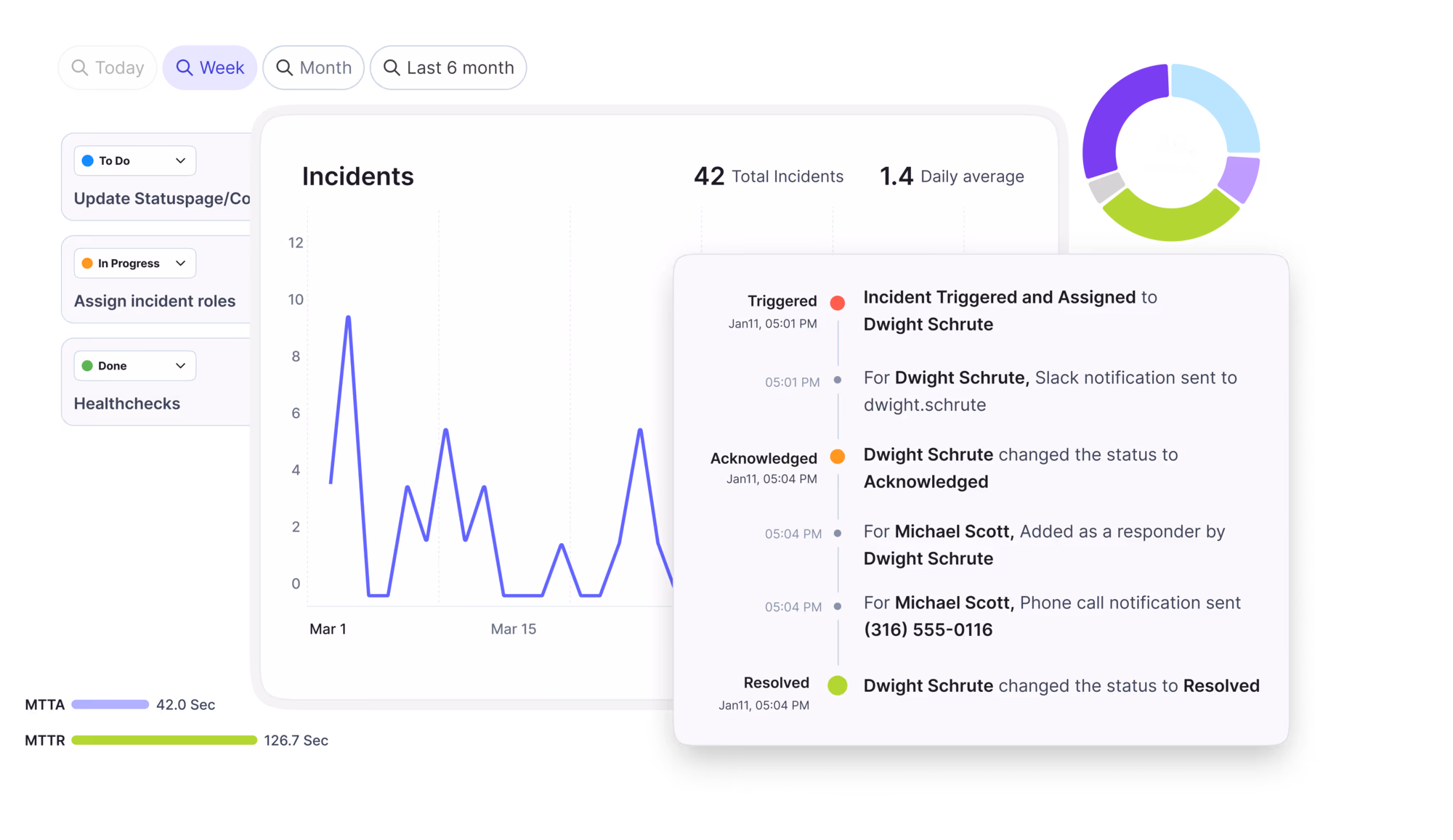
Learn how organizations have reduced downtime, improved 50% MTTA & MTTR, and cut costs with Xurrent IMR.
Discover Xurrent IMR's quick support, bidirectional integrations with Jira and Slack, and more cohesive incident response capabilities compared to Opsgenie.
Understand why users value Xurrent IMR for its intuitive interface, efficient incident alerting, customizable On-call schedules, and escalations.

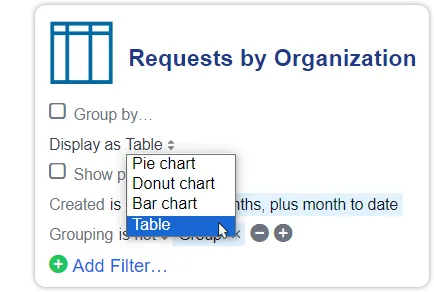
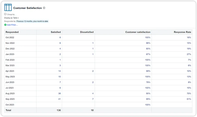
Most of the reports in the Analytics console can be displayed as several different chart types, such as a pie chart, a donut chart, or a bar chart. Even metric reports can be turned into another chart when they are grouped by a column of their data. A new chart type has now been added, which shows the data of reports in a table view.
The new display option is available for all reports, except heatmap reports, which are already displayed in a table view. Even complex reports, such as the ‘Customer Satisfaction’ report which consists of multiple graphs, can be displayed as a table. For each distinct value (graph) related to a value on the X-axis, a column with those values is added to the table. These values are clickable and open a view with the underlying data. Whenever possible, the table footer of a column shows the sum of the values in that column.

During the second SPARK event in Antwerp, I stood at the back of a training room and watched a customer build a custom integration with our new iPaaS, wiring Xurrent to another system in her stack that had never talked to it before. No services rep doing it for her. No statement of work, no project plan with a kickoff and a go-live date. Just a person with live beta access in her hands, connecting two systems by hand, and finishing it before her coffee went cold. A year ago that would have been a multi-week project with a budget attached. She looked up, a little surprised it had actually worked, and said something I have not stopped thinking about since. She said it just gave her her week back.
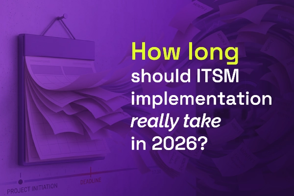
Most vendors will tell you ITSM implementation takes six months to a year — but modern, configuration-first platforms have rewritten the math entirely. See what real implementations look like in 2026, and why a long rollout is now a choice, not a given.

.webp)
.webp)