Use Filter to Group Report Data
An important new analytics capability has been added that makes it possible to break down the data in a report by the same values that can be selected when a filter is defined for a report. This makes it possible to compare information in a single report, instead of having to add multiple reports to a dashboard to make the same comparison.
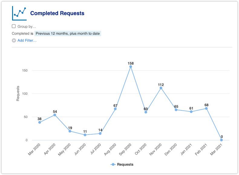
It is best to illustrate this with an example. When the ‘Completed Requests’ report is opened, a line chart is displayed with a single line.

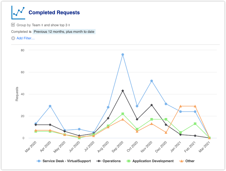
By checking the ‘Group by’ box and selecting one of the filters that is available for the report, it is possible to group the data. This causes the single line to be split into multiple lines. The number of lines can be increased or decreased by clicking on show top. By default it is set to 3. Below is what the example report looks like after it is grouped by ‘Team’.

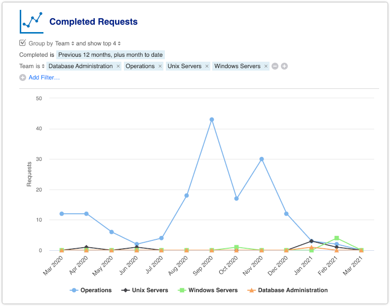
To compare specific teams, these teams can be applied as a filter to the report. In this example, four teams are selected in the filter and the show top has been increased to 4.

Note the ‘Group by’ option offers only the filters that are based on checkboxes, dropdown fields and fields in which another record can be selected.
